radio 按钮在不同浏览器会有不同的 UI,在实际的业务开发中,出于对体验一致的考虑,往往会自定义下样式。当然,方式有多种,但是如果要考虑可访问性(accessible),可选择的技术实现就不多了,这篇文章就是介绍其中一种最佳实践。
大概过程
- 初始化 HTML 代码
- 使用 CSS 创建标签伪元素
- 增加选中效果(selected)
- 增加聚焦效果(focus)
- 增加禁用效果(disabled)
开始撸代码
初始化 HTML
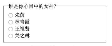
radio 按钮,也叫单选按钮,一般是多个同时出现。现在,罗列几位美女,请选出你心目中的女神:
<fieldset>
  <legend>谁是你心目中的女神?</legend>
  <div class="radio-wrapper">
    <input type="radio" name="goddness" id="zhuyin" />
    <label for="zhuyin">朱茵</label>
  </div>
  <div class="radio-wrapper">
    <input type="radio" name="goddness" id="linqingxia" />
    <label for="linqingxia">林青霞</label>
  </div>
  <div class="radio-wrapper">
    <input type="radio" name="goddness" id="wangzuxian" />
    <label for="wangzuxian">王祖贤</label>
  </div>
  <div class="radio-wrapper">
    <input type="radio" name="goddness" id="guanzhilin" />
    <label for="guanzhilin">关之琳</label>
  </div>
</fieldset>fieldset把所有的 radio 按钮从逻辑上归为一组,legend相当于组的标题,在这里就是问题的标题,当然,不要忘了把label用id和for关联起来。
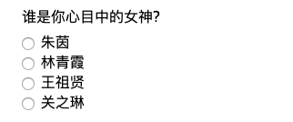
略微修饰下
原生样式略丑,我们开始优化下:
首先,设置下字体,同时把 fieldset 的框去掉。
* {
  font-family: "Microsoft YaHei", 微软雅黑, Tahoma, Arial, sans-serif;
}

fieldset {
  border: none;
}
代码不多,但是这样一搞,像那么回事了!
接下来,进入正题!
创建伪元素
针对label新增::before 伪元素(使用 sass)
$muted-red: #db3846;

input[type="radio"] {
  + label {
    position: relative;
    cursor: pointer;
    margin-left: 20px; /* 这个后面会调整 */

    &::before {
      content: "";
      position: absolute;
      left: -22px; /* 这个后面会调整 */
      width: 20px;
      height: 20px;
      background: $muted-red;
    }
  }
}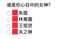
为了方便看伪元素的效果,我们用红色背景突出下。
似乎选项之间有点拥挤,我们再加点间距
.radio-wrapper {
  margin: 0.5rem 0;
}
美化伪元素 3
input[type="radio"] {
  + label {
    position: relative;
    cursor: pointer;
    margin-left: 20px; /* 这个后面会调整 */

    &::before {
      content: "";
      position: absolute;
      left: -24px; /* 这个后面会调整 */
      border-radius: 50%;      border: 1px solid #6f686a;      width: 18px;
      height: 18px;
      background: transparent;    }
  }
}
直到现在,依然要保留原生的那个标准 raido,方便调试。
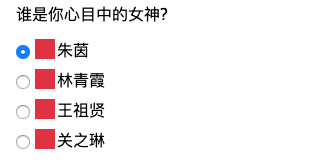
增加选中样式
利用::checked,我们可以控制选中样式。当然,在此之前需要对 label 再加个::after伪元素。
input[type="radio"] {
+ label {
position: relative;
cursor: pointer;
margin-left: 20px; /* 这个后面会调整 */
&::before {
content: "";
position: absolute;
left: -24px; /* 这个后面会调整 */
border-radius: 50%;
border: 1px solid #6f686a;
width: 18px;
height: 18px;
background: transparent;
}
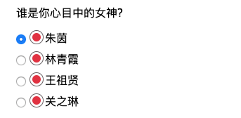
&::after { content: ""; position: absolute; left: -20px; top: 4px; border-radius: 50%; width: 12px; height: 12px; background: $muted-red; } }
}现在,长这样了:
接下来,微调下,只在选中的情况下给::after背景色:
input[type="radio"] {
+ label {
&::after {
content: "";
position: absolute;
left: -20px;
top: 4px;
border-radius: 50%;
width: 12px;
height: 12px;
}
}
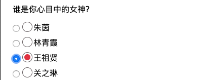
&:checked { + label::after { background: $muted-red; } }}现在,只有选中选项之后,才有样式,有点意思了!
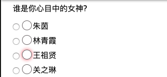
为了满足可访问性(accessible),需要关注下获取焦点时候的样式
新增获取焦点的样式
目前,如果选项获取焦点,::after是没有样式的,利用:focus和box-shadow组合,我们可以优化下这块的样式:
input[type="radio"] {
  &:focus {
    + label::before {
      box-shadow: 0 0px 8px $muted-red;
    }
  }
}
新增禁用样式
同样的道理,:disabled可以做到禁用样式的自定义。新增个女神,范冰冰。
&:disabled {
  + label::before {
    border: 1px solid #ddd;
    box-shadow: 0 0px 4px #ddd;
  }
}
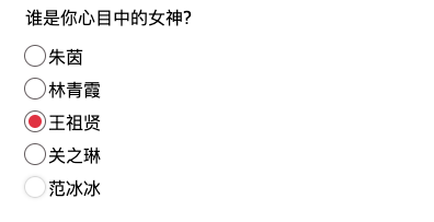
大结局
- 原生 radio 的历史使命已完成,隐藏掉。
- 去掉 label 的左间距
input[type="radio"] {
  opacity: 0;

  + label {
    position: relative;
    cursor: pointer;
  }
}
最终样子:
总结一下
自定义 radio 样式做到了以下几点:
- 使用正确的语义 HTML 结构
- 使用伪元素自定义元素样式
:checked、:focus和:disabled来定义不同的状态,尤其是:focus,满足了可访问性。opacity: 0隐藏掉原有的 radio 按钮
源代码在此:
See the Pen accessible radio buttons by Tristan (@zerosoul) on CodePen.